Black Tray Campaign
The campaign was borne from brand confusion between Meals on Wheels South Texas and a local competitor service. It was the classic tissue/Kleenex soda/Coke problem: our community and even the competing organization’s own volunteers referred to any home-delivered meals as “meals on wheels,” which led to daily calls from the other org’s clients.
My team determined a need to differentiate ourselves to 1) protect the Meals on Wheels brand from services not held to the same high standard as member orgs, 2) save staff time and resources that were being consumed by confused beneficiaries, and 3) honor the hard work of our professional kitchen, whose meal quality is highly regarded, versus the other org’s less favored plates.
Photographs in local Facebook shaming groups helped us identify how we best stood out visually. Aside from our meals looking truly delectable, we used black trays as opposed to beige. It was simple and provided a phrase with strong phonetics to use in promotions.
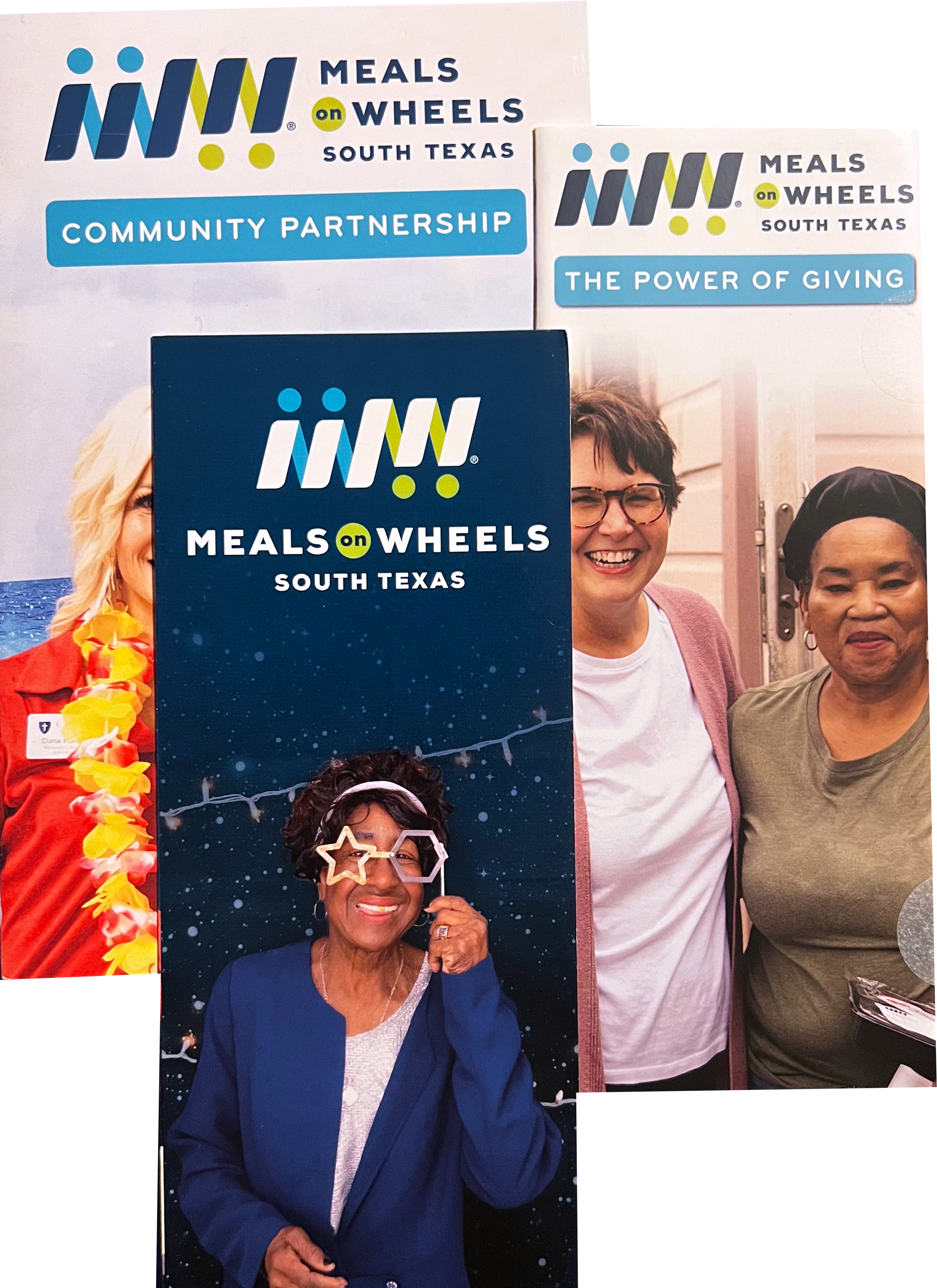
Core Branding: Meals on Wheels South Texas
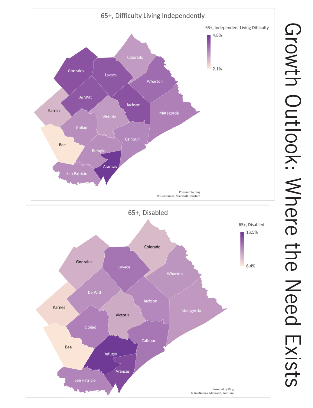
Previously, Meals on Wheels South Texas was known as the Victoria Senior Citizens Association, or colloquially as the local senior center. The choice of the organization’s new name was based on research I conducted to identify how this particular piece of Texas identifies itself. My findings guided our team to determine that the extent of local needs and heat map data on regional name usage required a broader name. Other options – Meals on Wheels of the Crossroads, Mid-Coast, Golden Crescent, and others – were revealed to refer specifically to our home county of Victoria, and because MOWSTx is the largest home-delivered meal provider for that central rural expanse, Meals on Wheels South Texas won out as a brand which would best describe where we serve to those needing service. Moreover, it appeals to state pride more easily with its regional quality – a strong device in a place like Texas.
I focused on two goals with the rebrand: a unified visual identity and moving away from the “senior center” image to a place where adults age 60 and older can have fun, have a great lunch, and seek resources to thrive as they age in place.
The rebrand included new paper collateral and advertising. I developed a series of icons for all MOWSTx departments. Brochures were made to look cohesive, with dark versus light color schemes drawing emphasis to primary information pieces. New outdoor advertising aimed to fight the idea of Meals on Wheels as sad, tasteless food and inspired the Black Tray Campaign.


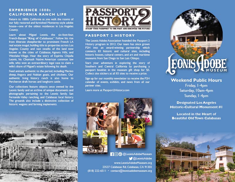
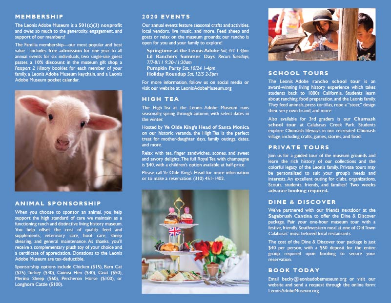
Core Branding: Leonis Adobe Museum
This brochure confirmed the branding standards for museum marketing collateral which I worked to develop since taking over communications. It firmly established the updated version of the hand-carved Leonis Adobe logo, pulled from the museum’s street-adjacent signage and most familiar to the public.
The colors are pulled from the combination of the two primary site images used to represent the museum. The first is the foregrounded California poppies shot, which is used across museum social media to reference California history; the blue is complementary to the poppies’ orange. The blue is drawn directly from the in-focus image of the adobe, front garden, and tankhouse, chosen for the lively lines of the photograph.
The second fold draws an intentional contrast by featuring the 1905 photograph of the adobe. The effect is to transport the reader back in time, just as they would experience visiting the museum.
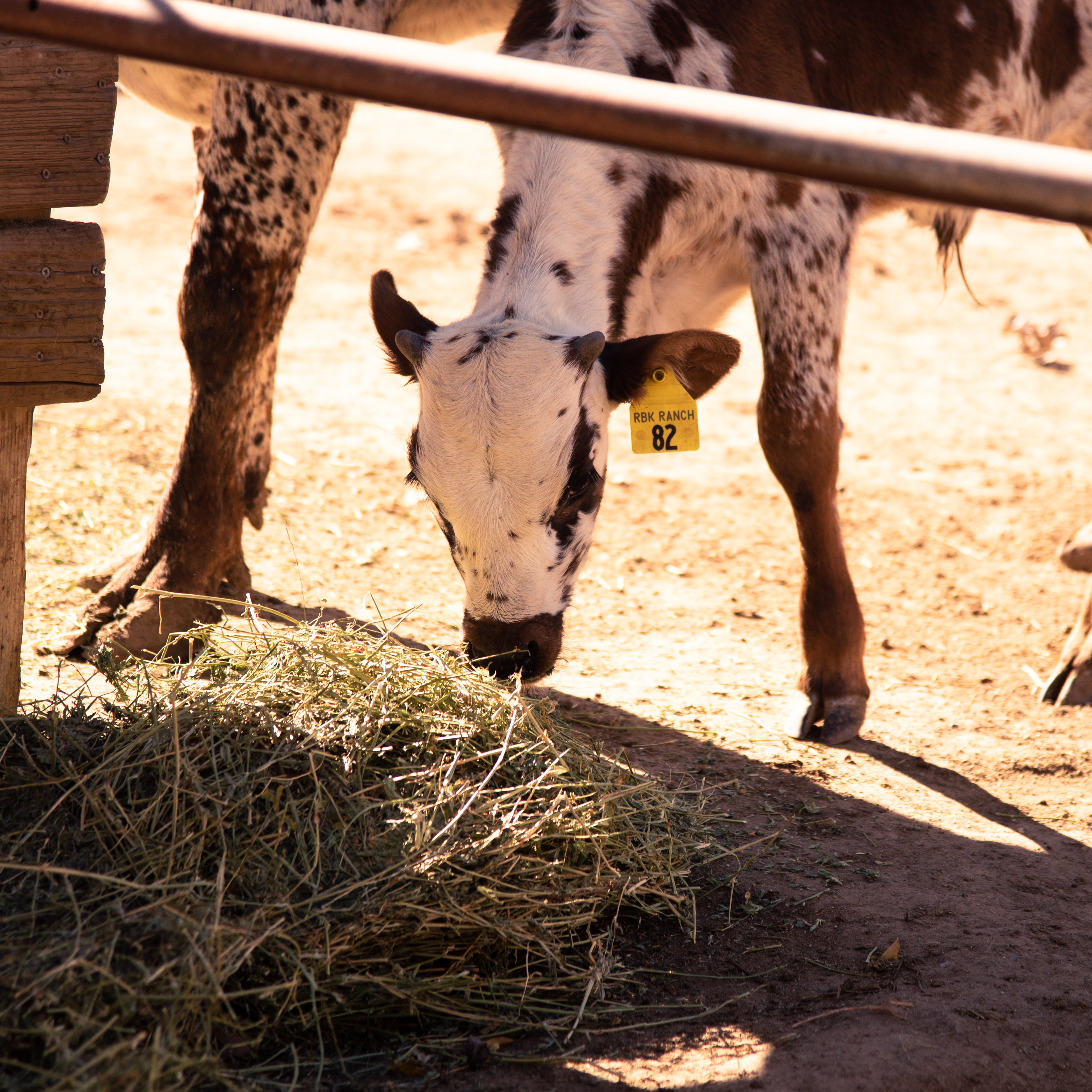
New Calf, New Character: In-House Clipart and Sustained Narrative Promotion
The Leonis Adobe Museum welcomed Baby Fred to the rancho, and visitors quickly fell in love. I incorporated him and his Mama as characters in promotional materials and social media, featuring frequent posts and creating coloring pages for events with outlines of the above “dancing longhorns” in-house clipart I designed. Visitors picked up the names and made connections with the ranch animals due to the ability to identify their new favorites.


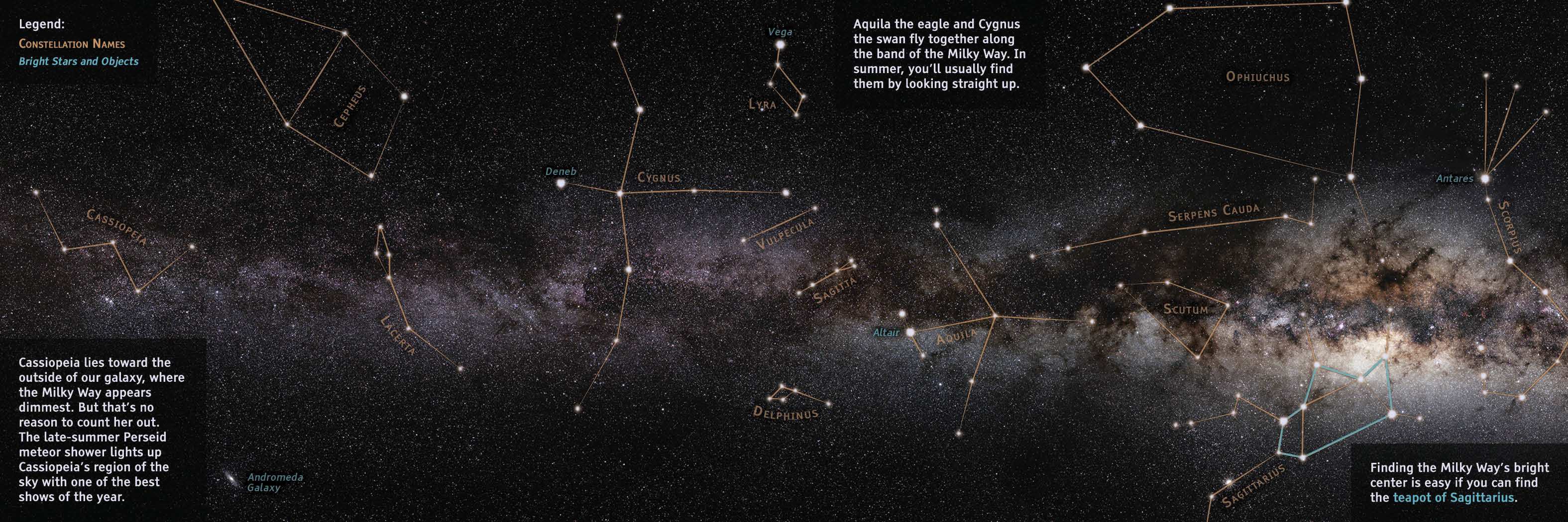
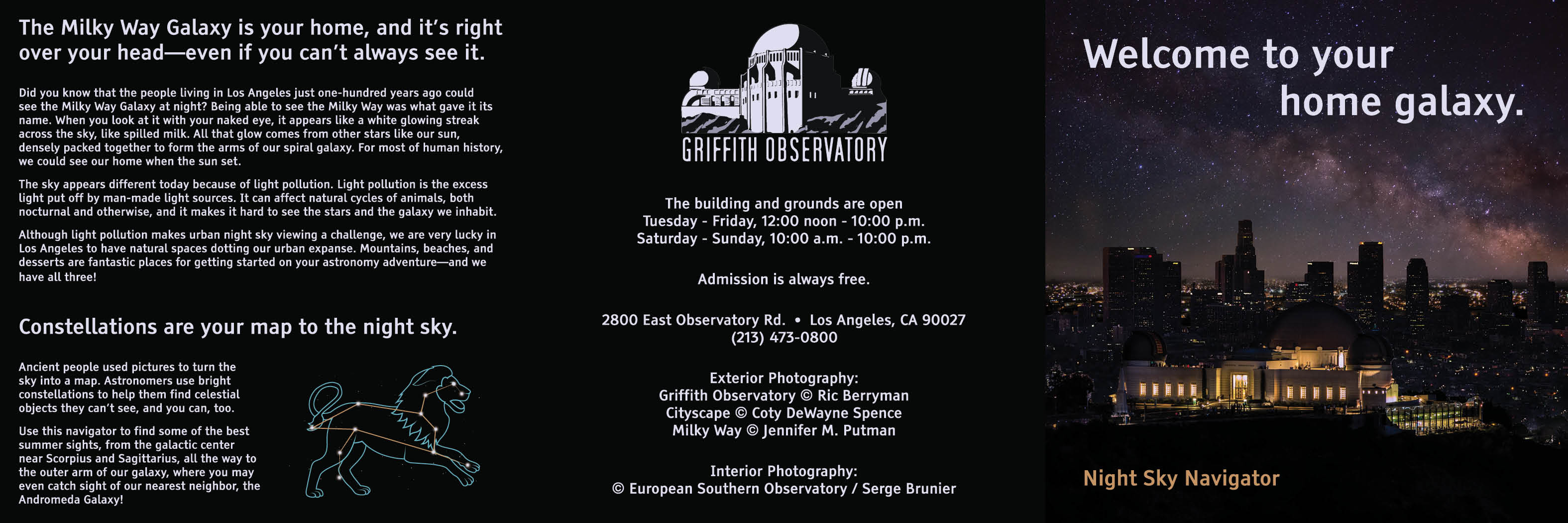
Night Sky Navigator
This foldable is designed for sale in a planetarium or science center gift shop. Each star and constellation is embossed and printed to glow in the dark, creating an interactive that gives the consumer a tech-free alternative roadmap for their first ever stargazing adventure.
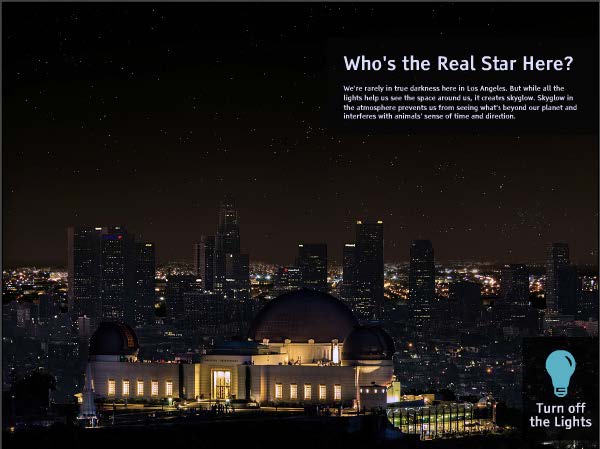
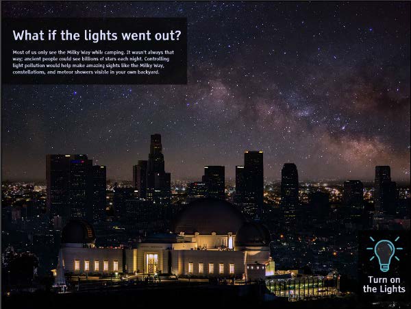
Paired with the foldable is an interactive, developed for a touch interface, which allows a visitor to “turn off the lights” and reveal what the sky sans light pollution might look like.
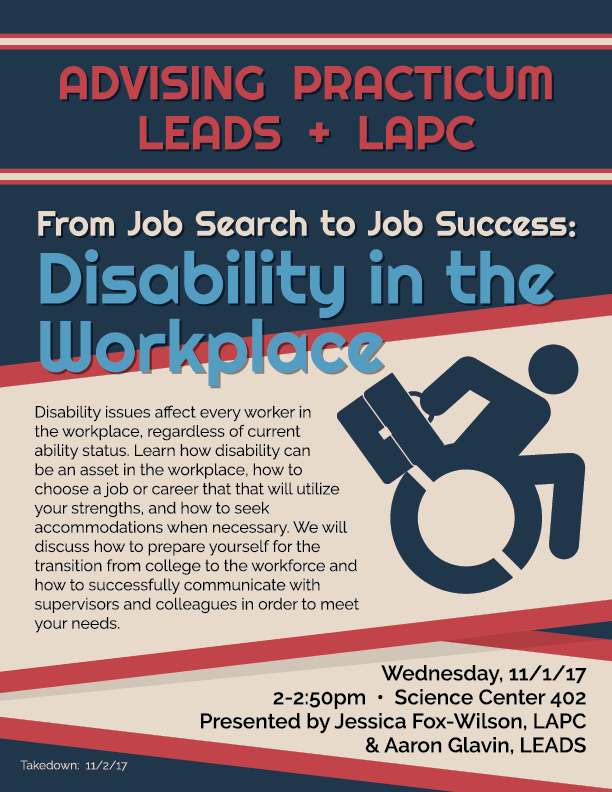
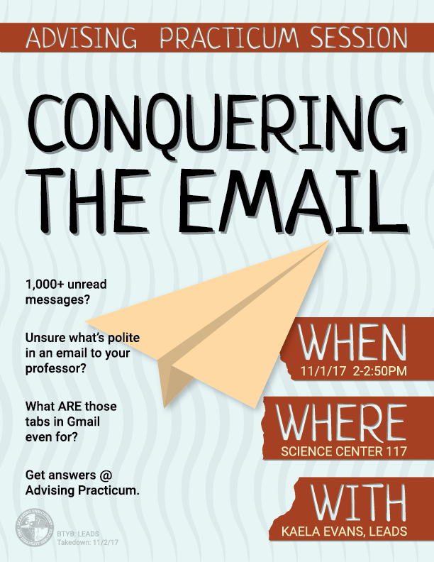
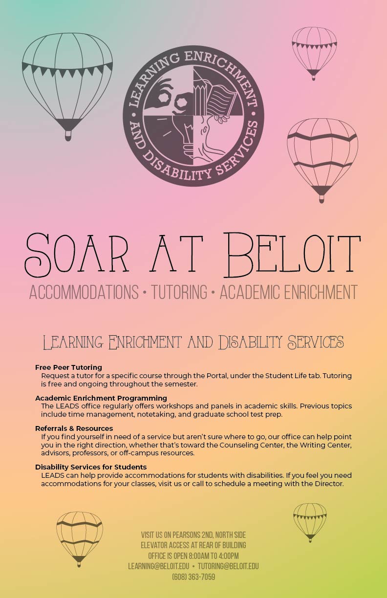
Core Brand: Learning Enrichment and Disability Services
Beloit College, like any college, had bulletins plastered with ads for events, all fighting for attention. When the campus trend turned toward louder visuals, I looked toward the then-growing design trend of “color transitions.” Quiet and minimal, these designs popped at the center of a hundred other posters. Touches of movement in lines and airy, faded application of fills give these a further sense of elevation and weightlessness.


Miscellaneous Designs